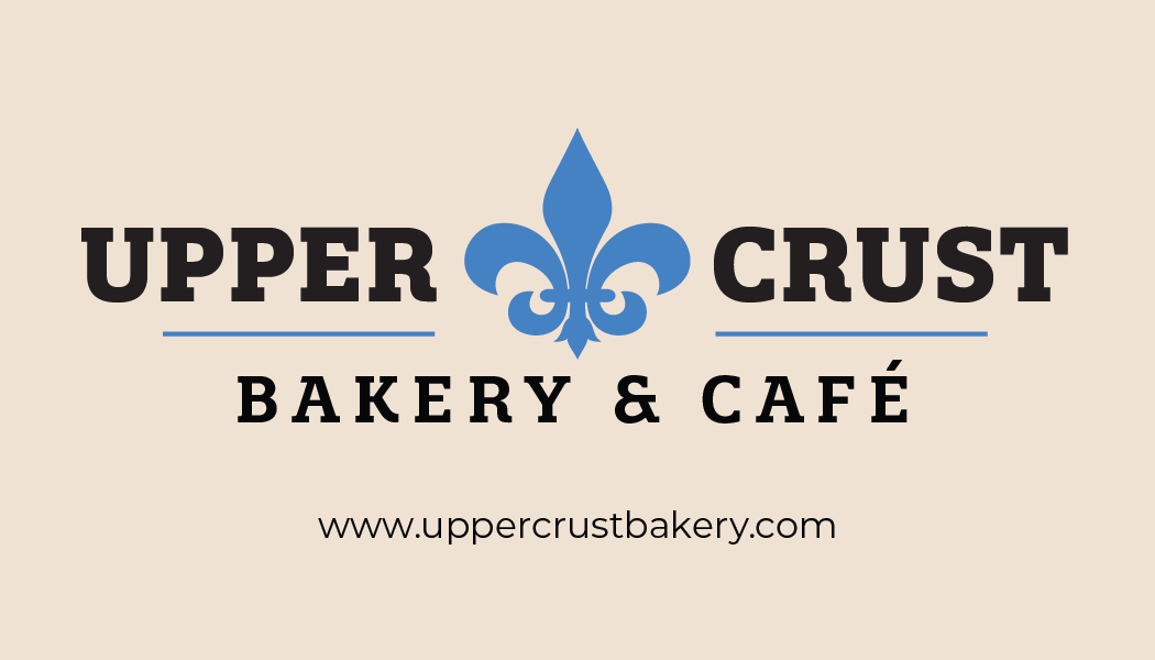
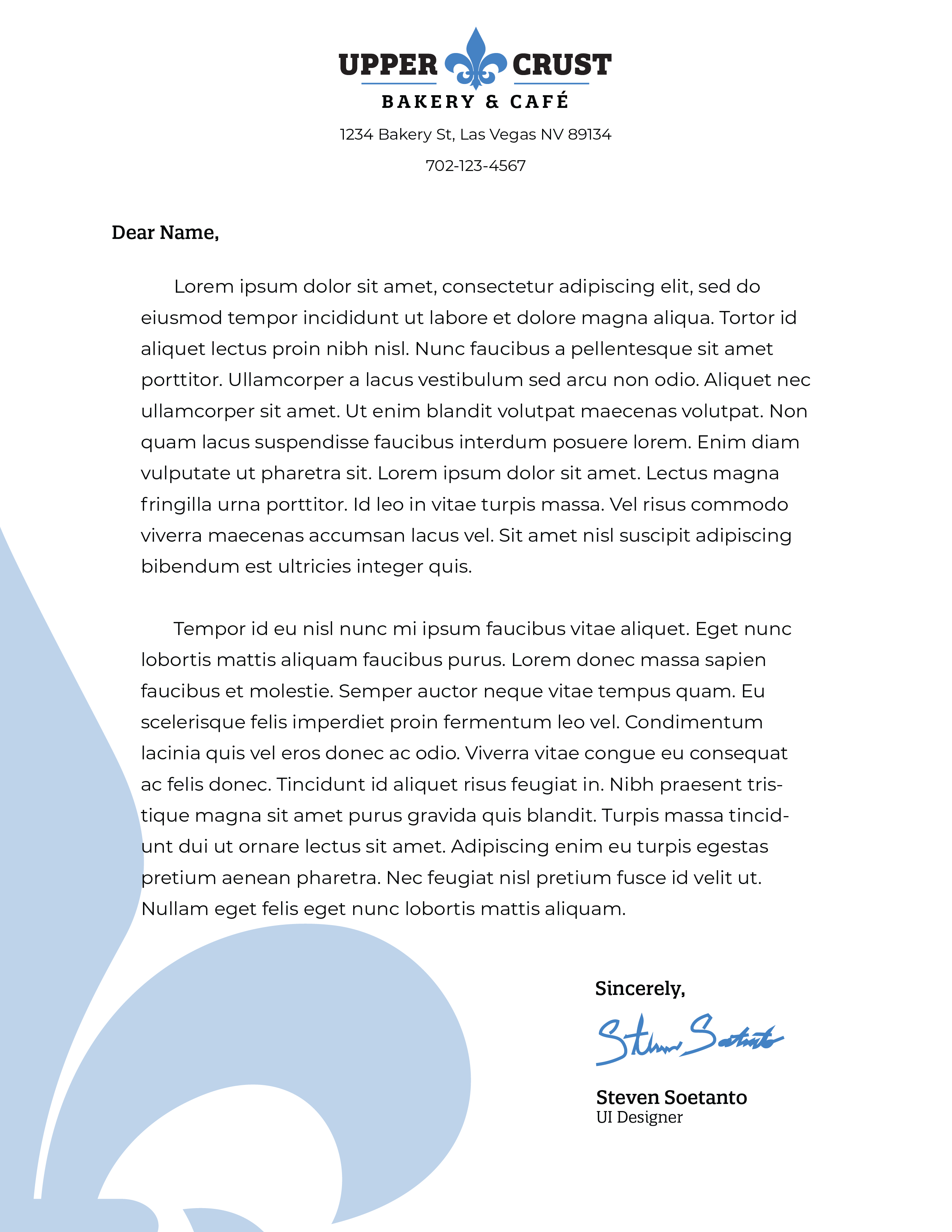
I chose to use the fleur-de-lis as a symbol for the client's logo to emphasize the French inspiration in their recipes, while utilizing a blue reminiscent of the French flag. Because the client used "classic" French recipes, I also went with a serif font to get the "old" and classic vibe.